
The first churn report I ever built was wrong, and nobody noticed for a quarter. The dashboard said 2.8% monthly churn, which the founders considered fine. What it did not say was that the accounts leaving were the ones paying the most, that half of them left inside their first sixty days, and that a third never chose to leave at all. Their cards simply expired. One number, three completely different problems, and no way to tell them apart.
That is the gap customer churn analysis fills. A churn rate tells you how many customers you lost. Churn analysis tells you which ones, when, why, and what you can do about it before the next batch goes. This guide walks through the whole thing: the formulas with a worked example, the types of churn you need to separate, the data to pull, how to find causes with a cohort table, how to score risk without a data science team, and which fixes map to which cause.
It sits alongside the rest of the customer analytics series here, and it leans on cohort analysis and customer segmentation more than once. If you have read those, some of the mechanics will feel familiar. Churn is where they pay off.
What Is Customer Churn Analysis?
Customer churn analysis is the process of measuring how many customers stop paying you over a period, breaking those lost customers down by segment, timing and behavior, and finding the reasons they left so you can prevent the next ones from leaving. The output is a set of causes ranked by revenue impact, each tied to a fix, not a single percentage.
The distinction matters because a churn rate on its own is a lagging indicator. By the time it moves, the customers are gone. Churn rate analysis, done properly, turns the same data into leading indicators: which cohorts are drifting, which behaviors precede a cancellation, and which segments carry the most risk right now.
The people who need this are anyone with recurring revenue or repeat purchase, whether they call it churn, customer attrition or lapse. SaaS teams are the obvious case, but subscription boxes, memberships, agencies doing client churn analysis on retainers, and ecommerce brands that live on repeat orders all have the same problem in different clothes. The mechanics below apply to all of them; only the definition of “churned” changes.
How Do You Calculate Churn Rate?
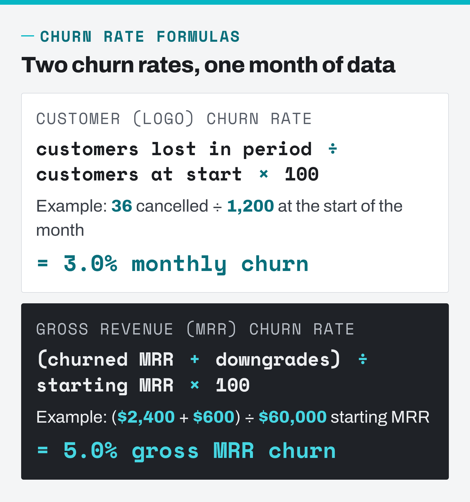
The customer churn rate formula is the number of customers lost during a period divided by the number of customers you had at the start of that period, multiplied by 100. If you began the month with 1,200 paying customers and 36 cancelled, your monthly churn rate is 36 ÷ 1,200 = 3.0%. Customers who signed up during the month stay out of the denominator.
That definition hides three decisions, and getting them wrong is the most common reason two people at the same company report different churn numbers.
- Who counts as a customer at the start? Paying accounts only. Trials and free plans belong in a separate activation metric. Mixing them in makes churn look worse in months with heavy trial signups and better when trials are quiet.
- What counts as churned? For subscriptions it is the cancellation or the failed final payment. For repeat-purchase businesses you have to pick a silence threshold, such as no order in 90 days, and stick to it.
- Which period? Monthly is standard for monthly billing. Annual contracts need annual or quarterly churn, since a monthly figure will show near-zero for eleven months and a spike at renewal.
Do not annualize monthly churn by multiplying by twelve. Churn compounds. A 2% monthly churn rate leaves you with 0.9812 ≈ 78.5% of the base after a year, which is 21.5% annual churn, not 24%. At 3% monthly, annual churn is 30.6%. The gap grows with the rate, so a rough multiplication overstates the damage exactly when you are trying to model it carefully. Retention rate is simply the complement: 100% minus churn, so 97% monthly retention in our example.
Revenue churn and why it is often the bigger number
Customer churn, sometimes called logo churn, counts accounts. Revenue churn, or MRR churn for monthly billing, counts the money those accounts were paying. The two can move in opposite directions. Lose thirty small accounts and logo churn looks ugly while revenue barely notices. Lose three enterprise accounts and logo churn looks great while a tenth of your monthly recurring revenue walks out.
Gross MRR churn is the churned MRR plus any downgrades (contraction), divided by the MRR you started the period with. Net MRR churn subtracts expansion revenue from existing customers before dividing. Net revenue retention (NRR) is the same idea flipped into a retention figure: starting MRR minus churn minus contraction plus expansion, divided by starting MRR. ChartMogul’s SaaS metrics cheat sheet defines NRR as the percentage of revenue retained over a period after expansion gains are offset by contraction and churn, most often measured over twelve months.
Here is the same example month carried through all of them. Start of month: 1,200 customers, $60,000 MRR. During the month: 36 cancellations worth $2,400 in MRR, $600 of downgrades, $1,800 of upgrades.
| Metric | Formula | Worked example | Result |
|---|---|---|---|
| Customer churn rate | lost ÷ start | 36 ÷ 1,200 | 3.0% |
| Retention rate | 1 − churn | 100% − 3.0% | 97.0% |
| Gross MRR churn | (churned + contraction) ÷ start MRR | ($2,400 + $600) ÷ $60,000 | 5.0% |
| Net MRR churn | (churned + contraction − expansion) ÷ start MRR | ($3,000 − $1,800) ÷ $60,000 | 2.0% |
| Net revenue retention | (start − churned − contraction + expansion) ÷ start | $58,800 ÷ $60,000 | 98.0% |
| Annualized customer churn | 1 − (1 − monthly)12 | 1 − 0.9712 | 30.6% |
Notice that logo churn says 3% and gross revenue churn says 5%. The average departing account paid about $67 a month against a base average of $50. That single comparison, revenue churn against customer churn, is the fastest way to learn whether you are losing your best customers or your worst, and it should be the first line of every churn report.
Negative churn, the number growth teams chase
When expansion from existing customers outweighs everything you lose, net MRR churn goes below zero. That is negative churn, and it changes the shape of a business. David Skok’s SaaS Metrics 2.0 illustrates it with two cohort charts at a constant $6k of new bookings a month: with 3% monthly revenue churn, revenue flattens near $140k after 40 months; with 3% negative churn it reaches $450k and is still accelerating. Same acquisition, three times the outcome. Negative churn is not a target you can hit without either usage-based pricing or a real upsell path, but it is the reason revenue churn deserves as much attention as logo churn.
What Is a Good Churn Rate?
A good churn rate is one that is lower than your own rate last quarter and lower than businesses with a similar price point and billing model. Cross-industry averages are useful for a sanity check and little else, because a $12-a-month consumer app and a $2,000-a-month B2B platform live in different worlds. Compare against your own history first, then against a narrow peer group.
For a reference point with real data behind it, Recurly publishes churn benchmarks drawn from subscription businesses on its own billing platform. In the July 2026 update, the median SaaS churn rate across their network is 3.22%, split into 2.16% voluntary and 1.06% involuntary. The overall figure across all industries is 3.60%. Recurly labels these as annual medians; whatever period you compare against, two patterns in that data are more useful than the headline number.
- Involuntary churn is a third of the total. Roughly one in three lost subscribers did not decide to leave. A payment failed. That share is recoverable with billing fixes alone, before you touch the product.
- Churn falls as revenue per customer rises. Recurly’s $10–$25 monthly tier shows 4.29% churn with 1.30% involuntary; the $250-and-up tier shows 3.07% with just 0.18% involuntary. Higher-paying customers use better payment methods and fix failed cards themselves.
What this means in practice is that “healthy churn” is a segment-level question. A blended 3% can hide 1% churn on annual enterprise plans and 8% on a monthly starter tier. High churn in one segment and low churn in another are two different businesses sharing a dashboard, and every number in the rest of this guide should be cut by segment before you trust it.
What Are the Types of Customer Churn?
There are four splits that matter, and each one points at a different fix. Voluntary versus involuntary tells you whether the customer chose to leave. Logo versus revenue tells you whether you are losing accounts or money. Contraction is the churn that hides inside customers who stay. And early versus late churn tells you whether the product failed to land or failed to keep delivering.
| Type | What happened | Typical cause | Where to look first |
|---|---|---|---|
| Voluntary churn | Customer cancelled on purpose | Value gap, price, competitor, no longer needed | Exit surveys, usage before cancel |
| Involuntary churn | Payment failed, subscription lapsed | Expired card, bank decline, limit hit | Billing decline codes, dunning flow |
| Contraction (downgrade) | Customer stayed, pays less | Seat reduction, dropped module, plan too big | Plan changes, feature adoption by tier |
| Early-life churn | Left within first 30–90 days | Onboarding failure, wrong-fit acquisition | Activation milestones, acquisition channel |
| Late-life churn | Left after months or years | Team change, unmet need, quiet decline in usage | Usage trend, support tickets, renewal touchpoints |
Involuntary churn deserves a special mention because it is the cheapest to fix and the easiest to overlook. Almost nobody exits a subscription intending to churn through a declined card. A retry schedule, a card-updater service and a plain email asking for a new card recover a large slice of it, and none of that requires a product change. Whenever a client’s churn is above their comfort level, I split it into voluntary and involuntary first, because half the time the fastest win is sitting in the billing system.
What Data Do You Need for a Churn Analysis?
You need one row per customer with a start date, an end date or “still active” flag, revenue per period, a handful of segment attributes, and whatever behavioral signals you can attach. That customer table is the backbone; everything else in churn analysis is a way of slicing it. You can build it in a spreadsheet for a few thousand customers and in SQL beyond that.
The sources that feed it, in rough order of how often they explain churn:
- Subscription and billing records. Start date, plan, price, upgrades, downgrades, cancellation date, cancellation reason if you capture one, and payment failures with their decline codes. This alone lets you compute every metric in the table above.
- Usage data. Logins, sessions, key actions, and feature adoption by week. This is where early warning signs live. A customer who logged in daily and now logs in monthly has told you something the billing table will not show for another two cycles.
- Segment attributes. Plan tier, company size, acquisition channel, signup month, country, industry, and any of the segments you already maintain. If you have run RFM analysis, the recency and frequency scores are excellent churn attributes for repeat-purchase businesses.
- Customer support and success interactions. Ticket volume, ticket sentiment, unresolved issues, escalations. A spike in tickets from one account in the month before renewal is a well-known precursor.
- Customer feedback. Exit surveys, net promoter score and customer satisfaction responses, cancellation-flow reasons, sales-call notes. Small samples, but they explain the “why” that behavioral data can only hint at.
You do not need all of it to start. Billing plus signup month is enough for a cohort table. Add usage data when you want prediction. Add feedback when you want causes. Trying to assemble a perfect dataset before running the first analysis is the most reliable way to never run it.
How Do You Find Out Why Customers Churn?
You find causes by asking four questions of the churned customers in order: when did they leave, who were they, what did they do or stop doing before leaving, and what did they say. Each question narrows the search, and by the fourth you usually have two or three root causes that explain most of the loss.
When they leave: onboarding churn versus renewal churn
Plot churn against customer age, in months since signup, and the curve almost always has two bumps. A large one in month one or two, and a smaller one around the first annual renewal. They have different causes, and they call for different customer retention work. Early churn means the customer never reached value: the product did not get set up, the team never adopted it, or the acquisition channel brought people who were never a fit. Renewal churn means value faded, or a budget owner who was never a user finally looked at the invoice.
Recurly’s benchmark analysis names low early-stage engagement as the single biggest driver of voluntary cancellations, and that matches what I see in client data. In the churn report I described at the top, 48% of the accounts lost in a quarter had been customers for less than 60 days. Everything the team had planned around “retention” was aimed at year-two customers. The problem was in week two.
Who they are: segment the churned customers
Split churn rate by every segment attribute you have and rank the customer segments by revenue lost, not by rate. A tiny segment with 20% churn matters less than a large one at 4%. The segments that repeatedly show up at the top become the focus of the analysis. This is the same discipline as any other customer segmentation work, applied to a specific outcome.
Watch acquisition channel especially. A discount campaign or a marketplace listing can bring a cohort that churns at double the base rate, and the acquisition team will report it as a success because they only see signups and customer acquisition cost, never the customers churning three months later. Churn by channel is the number that reconciles marketing’s numbers with finance’s.
What they did: behavior before the cancellation
Take everyone who churned in the last six months and look at their last eight weeks of usage. Then take a matched group who did not churn and look at the same window. The behaviors that differ are your leading indicators. In practice they tend to be a drop in login frequency, a core feature that stops being used, a fall in the number of active seats, or a spike in support tickets. If you already track micro-conversions, the post-sale version of that list is a good starting set of signals.
Feature adoption is the one I check first for SaaS. Customers who adopt the second and third core feature in their first month churn far less than customers who only ever use one, in every product I have looked at. If your data shows the same, “get them to feature two” becomes a retention strategy with a measurable target.
What they said: exit surveys and support history
Exit surveys are noisy. People pick “too expensive” when they mean “not worth it to me”, and response rates are low. They are still worth running, because they catch causes that behavior cannot: a competitor launch, a policy change, a team that was acquired. Keep the survey to one required question with five or six reasons plus a free-text box, and read the free text yourself once a month. It is the cheapest customer experience research you will ever run. Combine it with the support history of the same accounts and patterns appear quickly. Two of the three biggest churn causes I have found in the last few years came out of free-text fields, not dashboards.
Cohort Analysis: The Simplest Churn Analysis Worth Doing
A cohort table groups customers by signup month and shows what share of each group is still paying one, two, three months later. It is the single most useful churn analysis view because it separates the age of a customer from the calendar month, and it can be built in Excel or Google Sheets from a customer table with just a start date and an end date.
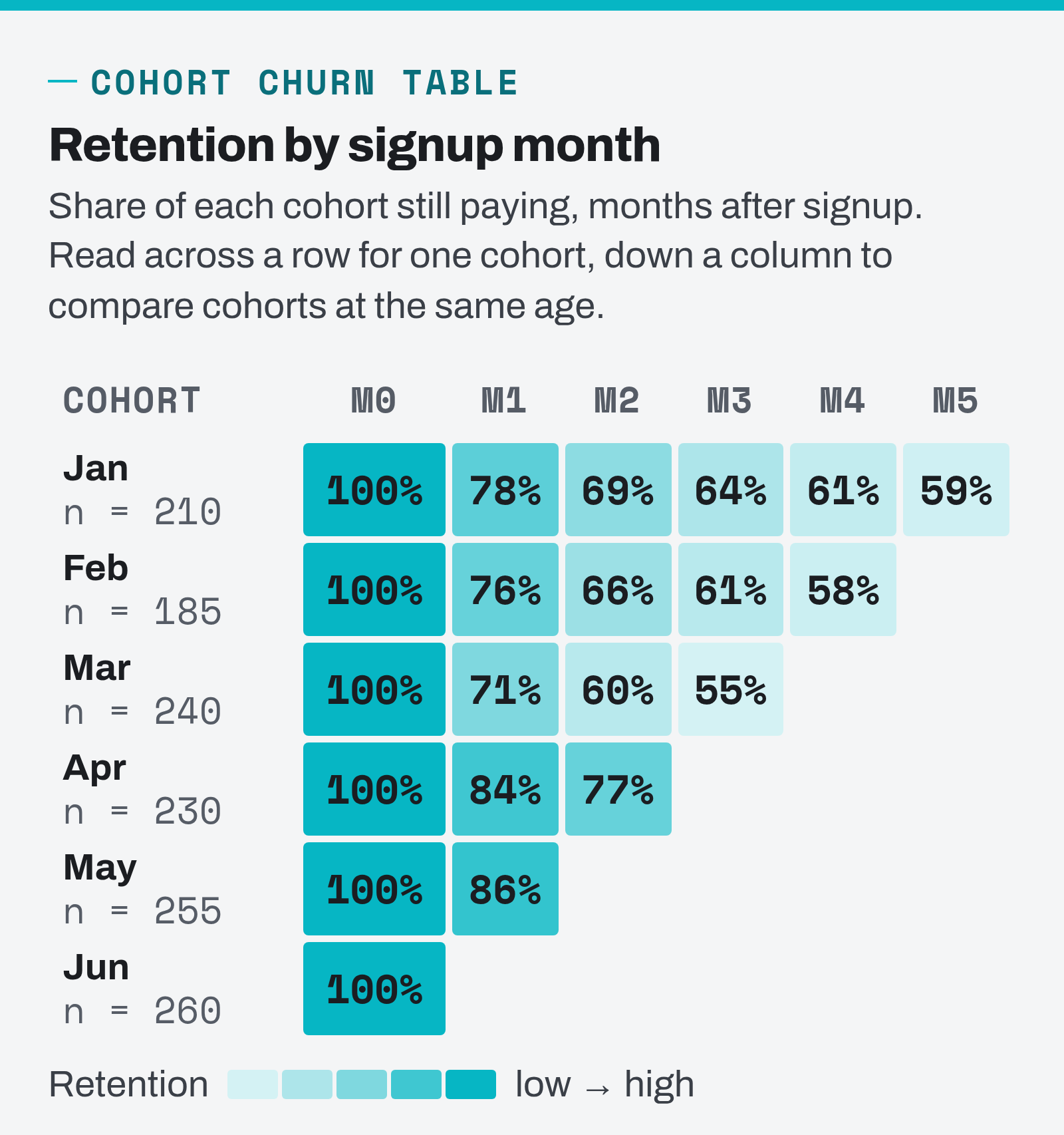
Building it takes four moves. Assign every customer to a cohort by their signup month. For each customer, compute the number of full months they stayed active. Count, for each cohort, how many customers were still active at month 1, month 2 and so on. Divide each count by the cohort’s starting size. In a spreadsheet that is a COUNTIFS per cell; in SQL it is a group by cohort month and age month. The cohort analysis guide covers the mechanics and the GA4 version if you want the long form.
Reading the table is where the analysis happens.
- Read down a column to compare cohorts at the same age. In the example, month-1 retention runs 78%, 76%, 71%, 84%, 86%. March is worse; April and May are better. Something changed between those cohorts, and the job is to find out what. Here it was a rebuilt onboarding flow shipped in early April, and a partner promotion in March that brought poor-fit signups.
- Read across a row to see where each cohort loses people. Every row loses the most between month 0 and month 1. That is the onboarding bump, and it is the first thing to fix because it hits every cohort.
- Look for the flattening point. January’s row goes 78, 69, 64, 61, 59. The drops shrink each month. Where the curve flattens is roughly the share of customers who have made your product a habit, and it is a much better long-term health number than a monthly churn rate.
Run the same table on revenue instead of customer counts and you get a revenue cohort, which is where net revenue retention becomes visible: a healthy B2B cohort can hold or even grow its revenue over time while its customer count slowly declines. Run it by segment (one table per plan tier or per channel) and the causes get more specific with every cut. Treat the table above as a churn analysis example to copy: the structure is identical for a subscription box, a membership site or a B2B platform. Cohort tables in Excel are unglamorous, and they answer more churn questions than any tool I have paid for.
How Do You Predict Churn Without a Data Science Team?
You build a simple risk score from the behavioral signals you found in the “what they did” step, weight them by how strongly each one separated churners from stayers, and flag every active customer above a threshold as at risk. This is a customer churn model in the practical sense: it does not need machine learning, and a version with four or five rules catches most of the accounts a fancier model would.
A rules-based risk score you can build this week
Pick the three to five behaviors with the biggest gap between churned and retained customers. Give each a point value in proportion to that gap. Score every active customer weekly. A workable first version for a B2B SaaS product looks like this.
| Signal (last 30 days) | Points | Why it is on the list |
|---|---|---|
| Logins down more than 50% vs. previous 30 days | 3 | Strongest single predictor in most usage datasets |
| Core feature not used at all | 3 | The product has stopped doing its job |
| Active seats reduced | 2 | Precedes contraction and cancellation |
| Two or more support tickets, any unresolved | 2 | Friction plus frustration |
| Failed payment in the last cycle | 2 | Involuntary churn in progress |
| Renewal within 60 days and no admin login | 1 | Budget owner disengaged before decision |
Accounts scoring 5 or more go on the at-risk list and get a human touch. Those at-risk customers are where retention effort returns the most, because you are reaching them before they have decided. Then, and this is the part people skip, check the score against reality after two months. Of the accounts you flagged, how many churned? Of the accounts that churned, how many had you flagged? If both numbers are well above what random guessing would give, the score is working. If not, adjust the weights. A score nobody validates turns into a list nobody trusts.
When to move to a proper churn prediction model
Once you have a few thousand customers and clean usage data, a logistic regression or a gradient-boosted classifier trained on the same features will outperform the rules, and it will tell you which features carry the weight. Customer churn prediction analysis of this kind is a standard exercise; the telecom churn dataset on Kaggle is the one most tutorials use, and the workflow ports directly to your own data. Keep the model interpretable. A retention team acts on “usage dropped and a ticket is open”; it does not act on a probability with no reason attached.
Survival analysis is the more advanced tool worth knowing about. Instead of asking “will this customer churn”, it models how long customers survive and how that changes with their attributes, and it handles the awkward fact that most of your customers have not churned yet (statisticians call that right-censoring). The Kaplan–Meier estimator gives you a survival curve per segment, which is a cohort curve with proper statistics behind it. The Python library lifelines does this in a few lines and its documentation is a good introduction. For most teams, survival analysis for customer churn is a second-year project; the cohort table and the risk score are year one.
How Do You Reduce Customer Churn Once You Know the Causes?
You reduce customer churn by matching each fix to the cause your analysis surfaced, starting with the causes that cost the most revenue, and measuring each fix with the cohort table rather than the blended rate. Generic retention programs fail because they treat churn as one problem. It is five or six problems, and the list below pairs each with the intervention that addresses it.
- Cause: early-life churn. Fix the onboarding path to the first moment of value. Define the two or three activation milestones that separate retained from churned cohorts, then rebuild the first-week experience around reaching them: guided setup, a checklist, a human call for higher tiers. Measure it as month-1 retention in the cohort table. This is the highest-return fix in most businesses because it lifts every future cohort.
- Cause: involuntary churn. Fix the billing recovery flow. Smart retries timed by decline code, an account-updater service so expired cards refresh automatically, and a short email sequence that asks for a new card in plain language. Measure it as recovered MRR. It usually pays for itself in the first month.
- Cause: shallow feature adoption. Drive customers to the second and third core feature with in-product prompts, targeted emails triggered by non-use, and success outreach for accounts on paid tiers. Measure adoption rate at day 30 by cohort.
- Cause: at-risk accounts drifting. Route the risk score into a weekly review. Every account above the threshold gets an owner and a specific action: a check-in call, a training session, a fix for the open ticket. Measure the churn rate of flagged accounts against unflagged ones and against the flagged accounts you did not reach.
- Cause: contraction and price sensitivity. Look at plan fit. Customers downgrading from a tier they never used tell you the packaging is wrong, not that they are cheap. Annual plans with a discount reduce monthly volatility and move the decision to one well-prepared moment. Measure net MRR churn.
- Cause: renewal churn from disengaged buyers. Build a pre-renewal playbook that starts 60 to 90 days out: a usage summary sent to the budget owner, a review call, and any open issue closed before the invoice lands. Measure renewal rate by cohort.
- Cause: customers who already left. Win-back campaigns to churned customers with a specific reason for returning: a shipped feature they asked for, a plan that now fits, a pause option instead of a cancellation. Measure reactivation rate. Former customers know your product, which makes them cheaper to reacquire than strangers, and a lot of voluntary churn is not permanent.
Every one of these ties back to customer lifetime value, because lifetime value is revenue per customer over churn. Cutting monthly churn from 5% to 4% lifts lifetime value by a quarter with no change to price or acquisition cost. That is why churn reduction is usually the cheapest growth available, and why the analysis that finds the causes is worth doing properly.
A Monthly Churn Report That Fits on One Page
The analysis only earns its keep if it repeats. The version I set up for clients is one page, refreshed monthly, in this order: customer churn and revenue churn side by side, split voluntary and involuntary; the cohort table for the last twelve signup months; churn by the two or three segments that matter most, ranked by revenue lost; the current at-risk list with owners; and a short section on what changed since last month and what the team did about it.
Start with whatever subset of that you can fill this week. A billing export and a spreadsheet will get you the first two sections by Friday. Pull one cohort table, find the worst month-1 drop, and go read the free-text exit reasons from that cohort. That is a complete customer churn analysis in miniature, and it will point at something specific to fix. Then run it again next month and see if the column moved.
FAQ
What is churn analysis in simple terms?
Churn analysis is the work of measuring how many customers stop paying you, splitting those lost customers by when they left, which segment they belonged to and what they did before leaving, and using those patterns to find the causes. The result is a short list of reasons customers leave, each attached to a fix you can test.
How do you calculate churn rate in Excel?
Put one row per customer with a start date and a cancellation date (blank if still active). For any month, count customers active on the first day with COUNTIFS on the dates, count those whose cancellation date falls in that month, and divide the second by the first. Extend the same COUNTIFS logic by signup month and you have a cohort table.
What is the difference between customer churn and revenue churn?
Customer churn counts heads: in the worked example, 36 of 1,200 customers cancelled, a 3.0% rate. Revenue churn counts dollars: those 36 accounts were paying $2,400 a month, another $600 left through downgrades, and $3,000 is 5.0% of the $60,000 starting MRR. The gap opens whenever the accounts that leave are larger or smaller than your average customer, so a useful churn report shows both rates next to each other every month.
What is negative churn?
Negative churn is what happens when the money your existing customers add through upgrades, extra seats or higher usage is larger than the money you lose when some of them cancel or downgrade. In the worked example above, the company lost $3,000 of MRR and won $1,800 back through expansion, so net MRR churn was still +2.0%. Had expansion been $3,600 instead, net churn would be −1.0% and net revenue retention 101%, which means the existing base grows on its own. Getting there takes pricing that scales with usage or a real upsell path.
How often should you run a customer churn analysis?
Refresh the core report monthly, because that matches most billing cycles and gives enough new data to see movement in the cohort table. Review the at-risk list weekly so someone can act on it while there is still time. Do a deeper cause analysis with exit surveys and support history quarterly, or whenever a cohort’s retention drops out of its normal range.
Do I need survival analysis to predict churn?
No. A cohort table plus a rules-based risk score built from four or five usage signals covers most of what a small team needs. Survival analysis and machine-learning churn models add precision once you have several thousand customers and clean behavioral data, and they are worth adopting at that point, but they are not a prerequisite for acting on churn.