
Most teams look at one number and call it a trend. Last month you had 1,000 signups; this month you have 1,100. Growth, right? Maybe. Maybe not. That single number hides whether the people who joined in January are still around, or whether you are quietly replacing churned users with new ones and running in place.
Cohort analysis is the fix. It groups users by a shared starting point and tracks how each group behaves over time. After a decade of staring at dashboards, I have come to treat cohort tables as the single most honest report I build. They expose problems that aggregate metrics paper over.
This guide walks through what cohort analysis is, how to read a cohort table without getting lost, and how to build one in practice. It sits inside the broader topic of audience segmentation, so if you have not mapped your segments yet, start there first.
What Cohort Analysis Actually Is
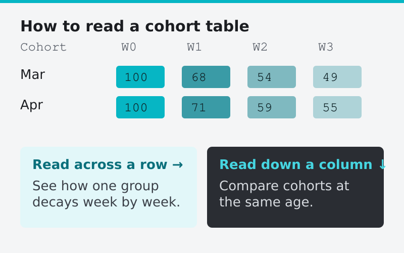
A cohort is a group of users who share a common characteristic within a defined time window. The most common version is the acquisition cohort: everyone who signed up in the same week or month.
Instead of asking “how many active users do we have,” cohort analysis asks “of the people who joined in March, how many were still active in April, May, and June.” You track each starting group separately, week after week, and watch the lines diverge.
The result is usually a table. Rows are cohorts (March signups, April signups, and so on). Columns are time periods since signup (week 0, week 1, week 2). Each cell shows the percentage of that cohort still active. Read across a row and you see how one group decays. Read down a column and you compare cohorts at the same age.
There are two broad flavors worth naming:
- Acquisition cohorts group people by when they first arrived. These answer questions about retention and product-market fit.
- Behavioral cohorts group people by an action they took, like “completed onboarding” or “invited a teammate.” These answer questions about which behaviors predict loyalty.
Both matter. Acquisition cohorts tell you if things are getting better. Behavioral cohorts tell you why.
Why a Single Retention Number Lies
Imagine your overall monthly retention sits at a steady 80%. Stable, you think. But split it by cohort and you might find that your oldest users retain at 92% while users acquired in the last two months retain at 60%. The healthy old guard is masking a fresh acquisition problem.
I ran into exactly this on a SaaS product a few years back. The blended retention number had not moved in five months, so nobody worried. The cohort table told a different story: every new cohort was retaining worse than the one before it. We had quietly broken something in onboarding after a redesign. The aggregate hid it for almost half a year.
That is the whole point of cohorts. They isolate change. When you stop blending everyone into one bucket, regressions and improvements both show up months earlier.
How to Read a Cohort Table
Cohort tables look intimidating the first time. They are not. Here is the reading order I teach every analyst I onboard.
First, scan the diagonal. The top-left cell is your most recent cohort at week 0 (always 100%). The bottom-right is your oldest cohort at its oldest measured age. The staircase shape is normal; newer cohorts simply have not aged enough to fill the right-hand columns yet.
Second, read down each column. This compares cohorts at the same age. If week-4 retention is climbing as you move from older to newer cohorts, your retention is improving. If it is falling, something recent is hurting you.
Third, read across each row. This shows the decay curve for a single cohort. Most products lose a chunk fast, then the curve flattens. A curve that flattens means you have found a core of users who stick. A curve that keeps sliding to zero means you have a leaky bucket with no floor.
Here is a simplified example to anchor the idea.
| Cohort | Week 0 | Week 1 | Week 2 | Week 4 | Week 8 |
|---|---|---|---|---|---|
| January | 100% | 62% | 48% | 41% | 38% |
| February | 100% | 58% | 44% | 36% | 32% |
| March | 100% | 55% | 39% | 30% | — |
Notice the column trend. Week-4 retention drops from 41% to 36% to 30% across the three cohorts. Each new group is doing worse. That is a flashing red light, even though any single cohort row looks like a normal decay curve.
The Flattening Point Is Your North Star
The most valuable thing a cohort curve reveals is where it flattens. Every product loses users early; people sign up, poke around, and leave. What separates durable products from leaky ones is whether the curve eventually levels off.
A curve that flattens at 35% means roughly a third of every cohort becomes a long-term user. You can build a business on that. A curve that keeps declining toward zero, even slowly, means you have no retained base. You are renting users, not keeping them.
When I evaluate a product’s health, the flattening point tells me more than any growth chart. Growth fixes a flat retention floor by pouring more water into the bucket. It does not fix a bucket with a hole in the bottom.
How to Build a Cohort Analysis in GA4
You do not need a fancy product-analytics tool to start. Google Analytics 4 ships with a cohort exploration report. Here is the practical setup.
- Open Explore in the left navigation, then choose the Cohort exploration template.
- Set the cohort inclusion to “First touch” so users are grouped by when they first arrived.
- Set the return criteria to a meaningful event, not just “any activity.” For a content site, that might be a second pageview session. For a SaaS app, it should be a core action like creating a project.
- Choose your granularity (weekly is the sweet spot for most products; daily is noisy, monthly is too slow to act on).
- Set the metric to active users or, if you have revenue events, to revenue per cohort.
The single biggest mistake here is leaving the return criteria as generic activity. “Came back to the site” is a weak signal. Define the return event as the moment a user gets real value, and your cohort table suddenly tells you about retention that matters rather than retention that is technically true but commercially meaningless.
Revenue Cohorts: The Version Finance Cares About
User-count cohorts answer whether people stick around. Revenue cohorts answer whether they are worth keeping. Instead of tracking the percentage of users still active, you track the revenue each cohort generates month after month.
This is where the magic of net revenue retention shows up. A great SaaS cohort can actually generate more revenue in month 12 than in month 1, because the users who stay also expand their accounts. When that happens, the revenue cohort curve slopes upward instead of down. That is the holy grail, and it is invisible in a user-count cohort.
The same table is also the cleanest way to track churn by cohort: a bad signup month shows up as a row that drops faster than its neighbors, long before the blended churn rate moves.
If you are tracking monthly recurring revenue, churn, and expansion, you already have the inputs. Pair this with the broader set of SaaS metrics every startup should track and you can build a revenue cohort that tells you the lifetime economics of each month’s signups.
Common Mistakes That Wreck Cohort Reports
I have watched smart teams draw the wrong conclusions from cohort tables. The errors cluster around a few repeat offenders.
- Tiny cohorts. A cohort of 20 users is statistical noise. One person leaving swings the percentage five points. Aggregate up to weekly or monthly cohorts until each group has a few hundred members at least.
- Comparing immature cohorts. Your newest cohort only has week-0 and week-1 data. Comparing its “retention” against an eight-week-old cohort is meaningless. Only compare cohorts at the same age.
- Using a vanity return event. Counting “opened the app” as retained inflates every number. Use a value event.
- Ignoring seasonality. A cohort acquired during a holiday promo may behave nothing like an organic cohort. Note the acquisition context next to each row.
Turning Cohort Insights Into Action
A cohort table is a diagnostic, not a fix. Once it shows you a problem, you have to localize it. If recent cohorts retain worse, look at what changed in onboarding, pricing, or acquisition channels during that window. If a behavioral cohort that completed a key action retains far better, your job becomes pushing more new users toward that action early.
That last move is the highest-leverage thing cohort analysis produces. Find the early behavior that correlates with long-term retention, then redesign onboarding to drive every new user to it. Companies that nail this have a name for it internally, but the discovery always starts in a cohort table.
Build the table, read it weekly, and let it change what you ship. Aggregate metrics will tell you that things are fine right up until they are not. Cohorts tell you the truth a quarter earlier.
FAQ
What is the difference between cohort analysis and segmentation?
Segmentation groups users by shared traits at a single moment, like plan tier or country. Cohort analysis adds the dimension of time, grouping users by a shared starting point and tracking how they behave across weeks or months. Cohorts are essentially time-aware segments.
How many users do I need for cohort analysis to be reliable?
Aim for at least a few hundred users per cohort. Smaller groups swing wildly when even a handful of people leave, which makes the percentages misleading. If your volume is low, widen the time window from weekly to monthly cohorts.
Should I use acquisition or behavioral cohorts?
Use both. Acquisition cohorts (grouped by signup date) tell you whether retention is improving over time. Behavioral cohorts (grouped by an action taken) tell you which behaviors predict loyalty so you can drive new users toward them.
What is a good retention rate in a cohort table?
It depends entirely on your product type, so chase the shape of the curve rather than an absolute number. A curve that flattens and holds steady is healthy regardless of the level. A curve that keeps declining toward zero signals a retention problem no amount of new acquisition will fix.