How to Build a Marketing Dashboard That Drives Decisions
I have built, inherited, and — more often than I care to admit — quietly abandoned more marketing dashboards than...

I have built, inherited, and — more often than I care to admit — quietly abandoned more marketing dashboards than...
I have built, inherited, and — more often than I care to admit — quietly abandoned more marketing dashboards than I can count. After ten-plus years in digital marketing, I can tell you the dirty secret of our industry: most dashboards are decoration. They look impressive in stakeholder meetings, they photograph well for LinkedIn posts, and they do almost nothing to help you make better decisions.
The data backs this up. Research consistently shows that roughly 40% of dashboards are rated 3 out of 5 or lower by their own users. Even more telling, 72% of marketers admit they regularly export dashboard data to Excel just to get the answers they actually need. Think about that for a moment. Nearly three-quarters of us build dashboards and then immediately work around them.
The root problem is not the tools. Looker Studio is powerful. Tableau is gorgeous. Power BI is deeply integrated. The problem is that we build dashboards around data availability rather than decisions. We connect every API we can find, drag every metric onto the canvas, and call it a day. The result is a wall of numbers that impresses nobody and informs even fewer.
This guide is different. I am going to walk you through a framework I have refined across SaaS companies, e-commerce brands, and lean growth teams — one that starts with the decisions you need to make and works backward to the data. It builds on the same principles covered in my website traffic analysis playbook, but extends them into a full dashboard system. If you are a SaaS founder trying to understand where your pipeline actually comes from, a lean marketing team of two or three people who cannot afford to waste hours in spreadsheets, or a growth marketer who needs to prove ROI to a skeptical CFO, this article is for you.
By the end, you will have a repeatable system for building dashboards that people actually open, trust, and act on. No fluff. No “it depends.” Just the framework, the tools, and the step-by-step process.
Before we build anything, we need to understand why dashboards die. In my experience, nearly every failed dashboard falls into one of three archetypes. I call them the Vanity Dashboard, the Frankenstein Dashboard, and the Ghost Dashboard.
This is the dashboard built for show. It is packed with impressive-sounding metrics — total impressions, page views, social followers, email list size — that trend up and to the right but tell you absolutely nothing actionable. I once inherited a dashboard at a B2B SaaS company that proudly displayed “total website sessions: 1.2 million.” Sounds great until you realize the conversion rate was 0.3% and nobody could tell me which channels were actually producing pipeline. The Vanity Dashboard exists to make the marketing team look busy, not to make the company smarter.
This is what happens when every stakeholder gets a say. Sales wants lead source data. The CEO wants revenue attribution. The content team wants engagement metrics. Product wants feature adoption. You end up with a 47-widget monstrosity that takes 90 seconds to load, answers nobody’s specific question, and requires a PhD in data visualization to interpret. The Frankenstein Dashboard tries to be everything to everyone and ends up being useful to no one.
This is the most common failure mode, and the saddest. Someone builds a genuinely thoughtful dashboard, presents it in a team meeting, gets a round of applause — and then nobody ever opens it again. Within three months, the data connections break, the filters go stale, and it becomes a digital artifact. The Ghost Dashboard dies not because it was bad, but because it was not woven into any actual workflow.
The root cause behind all three failures is the same: these dashboards were built around data, not around a decision cadence. Nobody asked “what decisions do we make every week, and what data do we need to make them?” Instead, they asked “what data do we have, and how can we display it?”
That distinction is everything. And it is the foundation of what I call the Decision-First Dashboard framework.

Here is the single most important thing I will tell you in this entire article: do not open your dashboard tool until you have written down the decisions your dashboard needs to support. Grab a notebook, open a blank document, whatever. But do not touch Looker Studio, do not touch Tableau, do not connect a single data source until you complete these three steps.
Not the metrics you track. Not the reports you send. The actual decisions. For most marketing teams, these sound something like: “Should we increase or decrease spend on Google Ads this week?” or “Which content topic should we prioritize next?” or “Is our trial-to-paid conversion healthy enough, or do we need to intervene?” If you cannot articulate the decision, you do not need the metric.
This is where discipline matters. For each decision, identify the single primary metric that most directly informs it. Not three metrics. Not a composite score. One number. You can have supporting context, but there should be one metric that, if you could only see a single number, would let you make a reasonable call.
This is what separates a decision-first dashboard from a monitoring dashboard. For each metric, define the specific value or range that triggers a specific action. Not “we will keep an eye on it.” A concrete threshold and a concrete response.
Here is what this looks like in practice for a typical SaaS marketing team:
| Decision | Metric | Source | Threshold | Action |
|---|---|---|---|---|
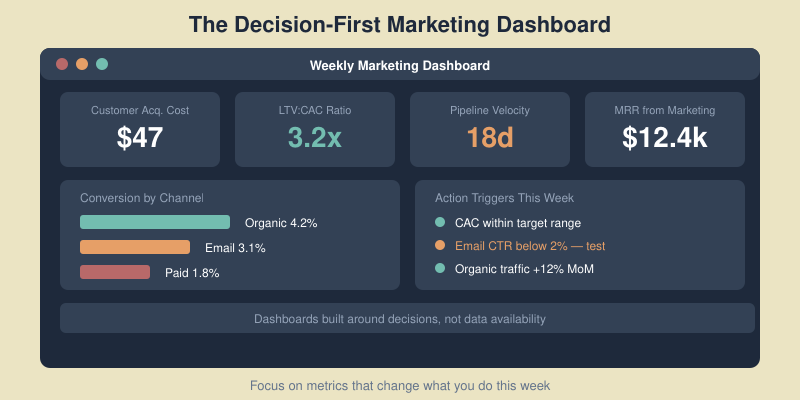
| Scale or cut paid spend? | Blended CAC | CRM + Ad platforms | CAC > $180 for 2 consecutive weeks | Pause lowest-performing channel |
| Is content driving pipeline? | Content-attributed SQLs | CRM + GA4 | < 15 SQLs per month | Shift 20% of content effort to bottom-funnel |
| Is email nurture working? | Nurture-to-demo rate | Email platform + CRM | < 2.5% conversion | A/B test new nurture sequence |
| Where to allocate next sprint? | Pipeline velocity by channel | CRM | Channel velocity drops 20% MoM | Reallocate resources to top 2 channels |
| Is trial experience healthy? | Trial-to-paid conversion | Product analytics + CRM | < 12% conversion rate | Trigger onboarding optimization sprint |
Notice what is not in that table: impressions, page views, follower counts, open rates as primary metrics. Those may appear as supporting context somewhere on the dashboard, but they are not driving decisions. When you start with this table, your dashboard practically builds itself.

Once you have your decision table, you need to populate it with the right KPIs. This is where most marketers go wrong — they either pick vanity metrics that feel good or they try to track everything and end up with analysis paralysis. I use a simple filter I call the “So What?” test.
For every metric you consider adding to your dashboard, ask yourself: “If this number changed by 20% tomorrow, would I do something different?” If the answer is no, the metric does not belong on your primary dashboard. It might belong in a detailed report or an ad-hoc analysis, but it should not occupy prime real estate on the screen your team looks at every morning.
Page views? So what — unless you can tie them to pipeline. Email open rates? So what — unless a drop triggers a deliverability investigation. Twitter follower count? So what — period.
These are the metrics that pass the “So What?” test for nearly every SaaS company I have worked with:
These metrics are useful for diagnosing why a Tier 1 metric moved, but they should not drive decisions on their own:
My hard rule: no more than 7 to 10 metrics per dashboard. If you need more, you need a second dashboard for a different audience or decision cadence — not a bigger dashboard. Research from Gartner tells us that 87% of executives say data is their organization’s most underused asset. The solution is not more data. It is the right data, in the right context, connected to the right decisions.

Now we get tactical. You have your decision table, you have your KPIs, and you are ready to build. Here is the exact process I follow every time.
Before you pick a tool, inventory where your data actually lives. For most marketing teams, it comes down to four core systems:
Write down every source, the specific metrics you need from each, and whether an API connector exists. This step takes 30 minutes and saves you hours of frustration later.
I am not going to tell you there is one right answer here because it genuinely depends on your budget and technical comfort. Here is my honest breakdown:
For most readers of this blog, I recommend starting with Looker Studio and Sheets. You can always migrate later.
This is the step everyone underestimates. Raw data from different sources does not agree with itself. GA4 will report different conversion numbers than Google Ads, which will differ from your CRM. This is normal and expected — each platform uses different attribution models and tracking methods.
My approach: pick one system of record for each metric type. Use your CRM as the source of truth for pipeline and revenue. Use GA4 as the source of truth for website behavior. Use ad platforms as the source of truth for spend. Do not try to reconcile the differences in your dashboard — just be consistent and document your choices.
Also, invest 30 minutes in UTM hygiene. Standardize your UTM parameters across every channel. Use lowercase. Use consistent naming conventions like utm_source=google and utm_medium=cpc, not sometimes “Google” and sometimes “google-ads.” Broken UTMs are the number one reason attribution dashboards produce garbage data.
Borrow from journalism. The most critical information goes at the top left — that is where eyes land first. Structure your dashboard in three horizontal bands:
Resist the urge to fill every pixel. White space is a feature, not a bug. If your dashboard requires scrolling, it has too much on it.
Not every metric needs real-time data. Match the refresh rate to the decision cadence:
Over-refreshing creates noise and anxiety. Under-refreshing creates blind spots. Match the cadence to how frequently the related decision gets made.

This is the section that separates a genuinely useful dashboard from a pretty picture. I have reviewed hundreds of marketing dashboards over the years, and I can tell you that a dashboard without action thresholds is just a screen with numbers on it. It generates anxiety, not insight.
The Metrics-to-Action Map is a simple document — it can be a table in a Google Doc, a section in your team wiki, or even a note pinned to your dashboard itself — that explicitly connects every key metric to a specific response. Here is what mine looks like for a typical SaaS engagement:
| Metric | Condition | Action | Owner | Timeframe |
|---|---|---|---|---|
| Blended CAC | Exceeds $180 for 2+ consecutive weeks | Pause lowest-ROI channel; reallocate budget to top performer | Paid lead | Within 48 hours |
| LTV:CAC ratio | Drops below 3:1 | Conduct channel-level profitability audit; cut unprofitable segments | Marketing director | Within 1 week |
| Pipeline velocity | Slows by 20%+ month-over-month | Diagnose bottleneck stage; deploy targeted nurture or sales enablement | Growth lead | Within 1 week |
| Trial-to-paid rate | Falls below 12% | Launch onboarding experiment; review activation events with product | Product marketing | Within 2 weeks |
| Content-attributed SQLs | Below 15 per month for 2 months | Shift 30% of editorial calendar to bottom-funnel comparison & use-case content | Content lead | Next sprint |
| Email nurture conversion | Below 2.5% | A/B test subject lines and CTAs; review segmentation logic | Email specialist | Within 1 week |
The magic of this map is that it removes ambiguity. When CAC spikes, you do not schedule a meeting to discuss what to do. You already know what to do, who does it, and how fast. I have seen teams using this approach make decisions up to 5 times faster than teams staring at dashboards and debating interpretation.
Print this map. Tape it to the wall next to your monitor. Reference it in every weekly standup. Over time, your team will internalize the thresholds, and the dashboard becomes a genuine decision engine rather than a reporting obligation.
“The goal is not to have a dashboard. The goal is to have a system where data triggers action without requiring a meeting.”
If you only implement one thing from this entire article, make it this map. Everything else is optimization. This is the foundation.
We cannot talk about dashboards in 2026 without addressing the AI elephant in the room. The good news: AI is not going to replace your dashboard. The better news: it is going to make your dashboard dramatically more useful. I see three practical applications that are ready for production use today — not science fiction, not hype, actual things I am using with clients right now.
Instead of manually scanning your dashboard for problems, set up automated anomaly detection that flags when any metric moves more than 2 or more standard deviations from its rolling average. Most BI tools now support this natively. Power BI has built-in anomaly detection. Looker Studio can achieve this with calculated fields and conditional formatting. The result is that you stop scanning and start being notified — a subtle but enormous shift in how you interact with data.
This one has been a game-changer for me personally. Every Monday morning, an automated workflow exports the previous week’s dashboard data as a CSV, feeds it to an LLM (I use Claude or ChatGPT depending on the client), and generates a plain-English summary: “CAC rose 14% week-over-week, driven primarily by a 22% increase in LinkedIn Ads CPC. Pipeline velocity held steady. Trial-to-paid improved slightly to 13.1%, above threshold.” That summary goes into Slack. Executives love it. It takes the interpretation burden off the marketing team and ensures everyone reads the same narrative.
Feed 6 to 12 months of historical data into a forecasting model, and you can project where your KPIs are heading before they arrive. This is not crystal ball territory — it is basic time-series analysis that AI makes accessible without a data science degree. Tools like Narrative BI, the built-in AI features in Looker Studio and Power BI, and even ChatGPT’s Advanced Data Analysis can generate surprisingly accurate 30 to 60 day forecasts for metrics like MRR, lead volume, and CAC.
The adoption numbers are compelling. According to recent Forrester research, 74% of B2B marketing teams now use some form of AI-powered analytics, reporting an average 23% boost in team productivity and 19% improvement in marketing ROI. These are not marginal gains. If you are not experimenting with AI on top of your dashboard data, you are leaving real performance on the table.
My recommendation for getting started: do not buy a new tool. Take your existing dashboard data, export it as a CSV, and have a conversation with Claude or ChatGPT about what the data is telling you. You will be surprised at the insights a fresh set of (artificial) eyes can surface.

Here is a pattern I see in every company that takes dashboards seriously: they start with one great dashboard, and within 18 months they have 37 dashboards, half of which nobody remembers building and the other half of which show conflicting data. Dashboard sprawl is real, it is insidious, and it undermines the trust you worked so hard to build.
Every dashboard should follow a conscious lifecycle: Build, Adopt, Iterate, Sunset. Yes, sunset. Dashboards should die. If a dashboard has outlived its usefulness, retiring it is not failure — it is hygiene.
Here are my three signals that a dashboard needs to be retired:
I keep dashboard governance simple because complex governance gets ignored:
[Team] - [Decision Area] - [Cadence]. For example: Marketing - Paid Performance - Weekly or Growth - Pipeline Health - Monthly. This sounds bureaucratic, but it makes searching and auditing painless.My ideal dashboard architecture for a marketing team of 5 to 20 people is one executive overview dashboard plus three to four operational dashboards. The executive dashboard shows only Tier 1 KPIs with trend lines and thresholds. Each operational dashboard goes deep on one area: paid acquisition, content and SEO, email and lifecycle, or product-led growth. The executive dashboard links to the operational ones for drill-down. This gives leadership the altitude they need and gives practitioners the detail they need, without either group wading through the other’s view.
Let me be direct about what a well-built dashboard saves you, because I have measured it across multiple engagements.
Time saved: A decision-first dashboard with automated data connections eliminates the manual reporting grind. I have seen teams achieve an 80% reduction in time spent on reporting — going from 8 hours per week pulling and formatting data to under 2 hours reviewing and acting on it. For a team of three marketers billing at $75 per hour, that is over $18,000 per year in recovered productive time.
Faster decisions: When your dashboard is wired to a Metrics-to-Action Map, you stop scheduling meetings to discuss what the data means. You already know. The average decision timeline I have measured drops from 5 to 7 business days (the typical “let’s review this at next week’s meeting” cycle) to 1 to 2 business days.
Reduced ad waste: By surfacing CAC and channel-level performance in near real-time, teams catch underperforming campaigns days earlier. On a $20,000 per month ad budget, catching a broken campaign or audience fatigue even 3 days earlier can save $2,000 to $3,000 per month in wasted spend.
The free option pays for itself immediately. Even if you go with Google Looker Studio at $0 in software costs and invest 8 hours of setup time, you will recoup that investment in the first month through time savings alone. There is genuinely no excuse not to start.
But the biggest ROI is one that does not show up in a spreadsheet: alignment. When everyone on the team — marketing, sales, product, the CEO — looks at the same dashboard and shares the same definitions of success, you eliminate an enormous amount of organizational friction. No more “my numbers say something different” conversations. No more attribution debates. One source of truth, one shared understanding, one direction.

Google Looker Studio (formerly Data Studio) is the best free option for most marketing teams, and it is not even close. It connects natively to GA4, Google Ads, Google Sheets, and BigQuery, and there are free community connectors for platforms like Facebook Ads, HubSpot, and Mailchimp. Pair it with Google Sheets as an intermediary data layer — pulling data from your various platforms into Sheets via add-ons or simple Apps Script automations, then connecting Sheets to Looker Studio — and you have a surprisingly robust setup. I have built dashboards with this stack for companies doing $10 million or more in annual revenue. The main limitation is that it lacks advanced statistical features and can be slow with very large datasets, but for 90% of marketing teams, it is more than enough.
I recommend a hard maximum of 7 to 10 metrics per dashboard view. This is not an arbitrary number — it aligns with cognitive load research showing that humans can effectively process and compare roughly 7 pieces of information at once. Your primary dashboard should feature 3 to 5 Tier 1 KPIs that directly inform decisions, supported by 3 to 5 Tier 2 metrics that provide diagnostic context. If you find yourself needing more than 10 metrics, that is a signal that you are trying to serve multiple audiences or decision cadences with a single dashboard. Split it into an executive overview and one or more operational dashboards instead of cramming everything onto one screen.
Match the refresh cadence to the decision cadence, not to your anxiety level. For most marketing teams, a daily refresh of campaign-level metrics (spend, leads, conversion rates) and a weekly refresh of strategic KPIs (CAC, pipeline velocity, MRR attribution) works well. Real-time or hourly refreshes should be reserved for specific scenarios like monitoring a product launch, a flash sale, or heavy campaign spend days where you need budget pacing visibility. In practice, I find that most teams check their dashboard twice: once at the start of the day for a quick pulse, and once during a weekly team review for deeper analysis. Set your refresh cadence to support those two moments, and you will be well served.
Absolutely, and I would argue that you should. The most effective dashboards I have seen were built by the marketers who use them, not by analysts working from a requirements doc. Modern tools like Looker Studio, Databox, and HubSpot’s dashboard builder are designed for non-technical users. The Decision-First Framework I outlined above does not require any SQL, Python, or data engineering skills — it requires clarity about your decisions and the discipline to keep things simple. Where a data analyst becomes valuable is when you need to connect complex data sources, build custom attribution models, or do advanced statistical analysis. But for a standard marketing performance dashboard? You have everything you need. Start with Looker Studio and Google Sheets, follow the steps in this guide, and you will have a working dashboard in a single afternoon.
A dashboard is a living, continuously updated view of your current state — think of it as a car’s instrument panel. It answers “where are we right now?” and “do we need to act?” A report is a point-in-time analysis that answers “what happened, why, and what should we do next?” Reports are narrative. They include interpretation, context, and recommendations. Dashboards are visual. They surface patterns and anomalies at a glance. You need both, but they serve different purposes. A common mistake is trying to turn a dashboard into a report by adding too much text and explanation, or trying to turn a report into a dashboard by stripping out the analysis. Let your dashboard handle the monitoring and alerting. Let your reports (weekly, monthly, or quarterly) handle the storytelling and strategic recommendations. The best marketing teams use dashboards daily and reports weekly or monthly, with the dashboard data feeding directly into the report narrative.
Honest reviews of analytics tools, SEO tactics that actually work, and growth strategies for bootstrapped SaaS — no fluff, no affiliate bias.